Find the perfect city for you using Meetups data
September 07, 2015
Some time ago I discovered a very nice tool to find nearby events and things to do around. It's called citypulse.io and I found it very useful.

Every night, they pull new data from:
- Ticketmaster (UK & US)
- Eventbrite.com
- Meetup.com (Meetup API)
- Viagogo.
After playing a little bit with the browser developper tools, I found out the url to get the datapulse data for a given latitude and longitude.
Thanks to this API I created a JSON file containing the 2015 events and meetups for Los Angeles and New York. Let's explore the data !
 Here
is a little python script that I put up to clean the data and plot some
bar charts to get insights. I use the pandas package which is very
practical to have a first glance of your data.
import pandas as pd import numpy as np import locale locale.setlocale(locale.LC_NUMERIC, '') # all = pd.read_json("allData.json") all.TicketPrice = all.TicketPrice.apply(lambda x: "$0.00" if isinstance(x, basestring) and x == "" else x) all['price'] = all.TicketPrice.map(lambda x : float(locale.atof(x[1:]))) all['isFree'] = all.price.apply(lambda x: 1 if x == 0 else 0) all['city'] = all.RegionId.map(3639:'Los Angeles',3633:'New York') # gro = all.groupby(['CategoryName','city']) temp0 = gro.CategoryName.count() my_plot1 = temp0.unstack().plot(kind='bar',title="Number of events per event category [Week 1 September 2015]",figsize=(10, 6)) my_plot1.set_xlabel("Event category") my_plot1.set_ylabel("Number of events") # temp2 = gro.isFree.sum()/gro.isFree.count() my_plot2 = temp2.unstack().plot(kind='bar',title='Percentage of Free events [Week 1 September 2015]',figsize=(10, 6)) my_plot2.set_xlabel("Event category") my_plot2.set_ylabel("Percentage of Free events") # temp1 = gro.price.sum()/(gro.price.count()-gro.isFree.sum()) my_plot3 = temp1.unstack().plot(kind='bar',title='Mean price per event category [Week 1 September 2015]',figsize=(10, 6)) my_plot3.set_xlabel("Event category") my_plot3.set_ylabel("Mean price of events")First I fill the empty strings in the ticket price column and replace ""
with "\$0.00".
Then I create a column "isFree" which will be useful to see which kind
of events are free in each city, but also to get the number of non free
events used to compute the mean price of the tickets.
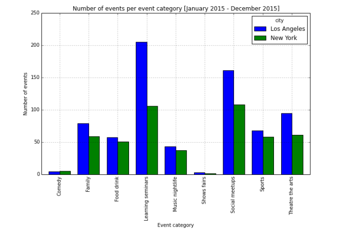
In the chart above, we can see that Los Angeles has more online events organised with a noticeable difference in the number of Learning meetups that could be explained by the important number of tech meetups in the area.
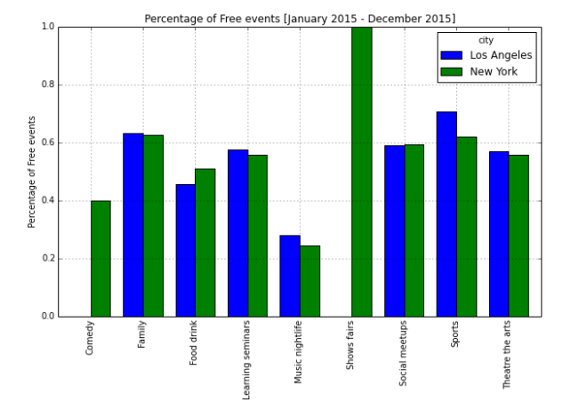
The chart above shows that there is no big difference in the percentage
of free events in every category. The data for the Comedy category
cannot be trusted because of the small number of events of this type in
the dataset.
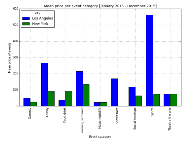
The chart above shows the mean price for the events of each category.
Note :
Before getting the data for the whole year, I started by looking at the
data for one month. The chart for the percentage of free events looked
different for that range, Looking at a large dataset is a way to get rid
of these biases.
Next Steps and Improvements:
-Looking at the evolution of trends over the years
-Compare with more cities

